![]()
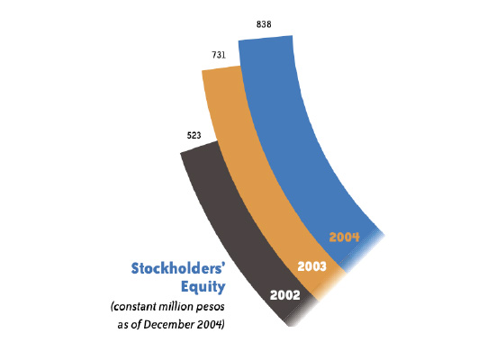
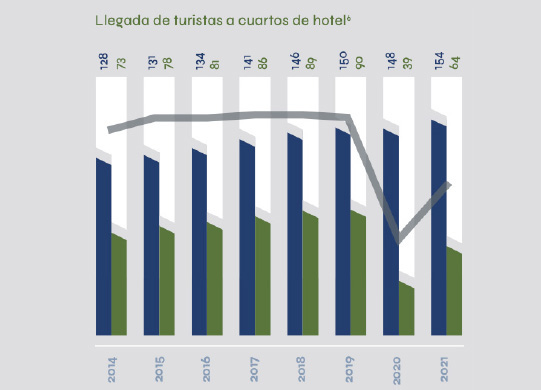
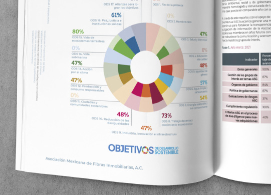
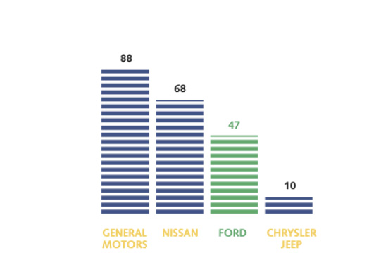
In designing charts for annual reports or presentations, it is crucial to prioritize legibility and data clarity to ensure that the information is easily understood by readers. Innovative design can capture attention and enhance the user experience.
Charts should be clean and organized, with clear labels and accurate legends, ensuring that data is correctly interpreted and effectively supports the financial narrative presented in the report.